Phase 7: The Rebrand — From Remember Everything to memset
The product outgrew its original name. We rebranded to memset — a name that captures what we actually built: a memory layer you set once and it persists everywhere.
Why We Rebranded
"Remember Everything" was the working name from day one. It described the aspiration perfectly: a tool that remembers everything across every AI tool you use. But as the product matured, the name started to feel wrong.
It was long. It was generic. It sounded like a note-taking app. And most importantly, it didn't capture the technical elegance of what we'd actually built — a persistent memory layer that sits beneath every AI interface.
Finding "memset"
The name memset comes from C programming. In C, memset() is a function that sets a block of memory to a specific value. It's a fundamental operation — low-level, universal, and essential. Every systems programmer knows it.
That resonated with what we're building:
- mem — memory, obviously
- set — to establish, to configure, to make permanent
- memset — you set your memory once, and it persists across every tool
The name works on multiple levels. For developers, it's an immediate callback to systems programming. For non-developers, it reads as "memory set" — which is exactly what the product does. And the .io domain was available.
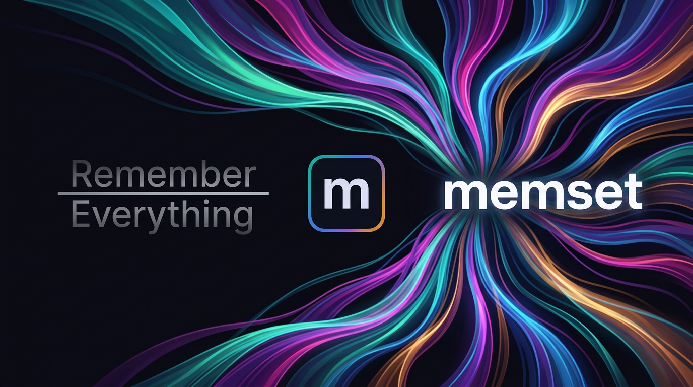
The Visual Identity
The old visual identity was... functional. Purple backgrounds, basic typography, no distinctive visual language. The kind of design that says "this was built by engineers who focused on the product first and the design second." (Guilty.)
For the rebrand, we developed a visual system built around the concept of streams — flowing lines that represent the convergence of knowledge across different AI tools. The streams visual communicates portability, connection, and flow — the exact qualities that define memset's value.
The brand palette anchors on four colors:
- Teal — trust, technology, depth
- Blue — reliability, intelligence
- Purple — creativity, premium quality
- Amber — warmth, human touch
These appear as gradient accents throughout the product — in the logo, the landing page, the dashboard, and marketing materials. The dark background (#0a0a12) gives everything a modern, focused feel without the harshness of pure black.
The logomark is a simple "m" inside a rounded square with a gradient border — minimal, recognizable, and functional at every size from favicon to billboard.
The Tagline
We went through dozens of tagline options:
- "One brain. Every AI. Your entire career." — too long, too ambitious
- "Your AI memory layer" — too technical
- "Remember once, know everywhere" — closer, but passive
We landed on: "Your AI memory, everywhere."
Five words. Clear subject (your AI memory), clear benefit (everywhere). It works in a header, on social media, in an app store description, or on a business card.
The Rebrand Process
Rebranding isn't just a new logo and color scheme. It touched every surface:
- Codebase — repository references, package names, API paths, error messages
- Web dashboard — landing page, auth flow, all internal pages
- Browser extension — name, description, icons, popup branding
- Documentation — product spec, user guides, privacy policy
- Social presence — Twitter, Indie Hackers, Product Hunt
- Infrastructure — domain configuration, email addresses, OAuth app names
The most tedious part was finding every instance of the old name in the codebase and replacing it consistently. Automated find-and-replace handles the obvious cases, but there are always string literals, comments, and documentation that need manual review.
What Changed, What Stayed
The rebrand changed how memset looks and feels, but didn't change what it does. The API surface, the extension behavior, the MCP integration, the intelligence features — all unchanged. The product was already solid; the brand just needed to catch up.
The biggest impact was on first impressions. "Remember Everything" looked like a side project. "memset" with its streams visual, gradient palette, and clean typography looks like a product built with intention. That matters when you're asking people to trust you with their knowledge.