Phase 8: Polish & The Modern Dashboard
Unicode emojis out, Lucide icons in. Sharp corners out, rounded cards in. We overhauled every surface to match the new brand — and the product finally looked as good as it worked.
Closing the Gap
After the rebrand, the landing page looked modern and polished. Then you'd log in and land on a dashboard that still had the old visual language — unicode emojis as icons, flat cards with no depth, inconsistent spacing, and a generic feel that didn't match the brand we'd just established.
This disconnect is common in products that evolve quickly. The outward-facing pages get design attention because they're the first thing prospects see. The internal pages that existing users live in every day get neglected. We decided to fix that.
The Icon System
The single most impactful change was replacing every unicode emoji and HTML entity with proper SVG icons from Lucide.
Unicode emojis render differently across operating systems and browsers. A checkmark emoji on macOS looks nothing like the same character on Windows. They can't be sized precisely, colored to match a palette, or styled with CSS. They look like afterthoughts.
Lucide icons are consistent, scalable, and take CSS styling. They're designed as a coherent set, so a checkmark icon on the billing page visually relates to a checkmark icon on the review page. This consistency is invisible when done right — you just notice the product feels more "professional" without being able to articulate why.
We replaced icons across every dashboard page:
- Overview — status indicators, quick action buttons
- Contradictions — conflict markers, resolution status
- Synthesis — pinned items, empty states
- Team — user and package indicators
- Learning — growth trends, recommendations
- Review — completion checkmarks
- Career — graph node types, transition status
- Projects — folder indicators
- Billing — feature checkmarks in tier cards
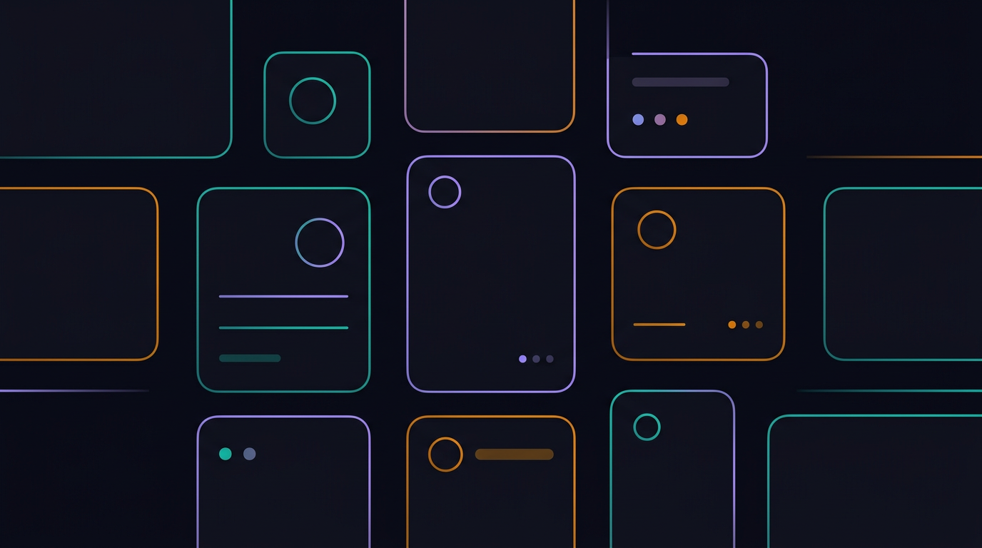
Card Design Language
Every dashboard component moved to a consistent card design:
rounded-2xl— generous corner radius for a modern, approachable feelbg-surface border border-border— dark card on darker background with subtle borderhover:shadow-lg hover:border-{color}/30— interaction states that use brand colors- Gradient accents — small touches of the teal/purple/amber gradient in headers, badges, and active states
The design language is deliberately restrained. Dark backgrounds, subtle borders, minimal color. The content is the focus, not the chrome. When color appears, it carries meaning — teal for success, amber for warnings, purple for interactive elements.
Typography and Spacing
We standardized the typography hierarchy:
- Page titles:
text-3xl font-bold tracking-tight - Section headers:
text-xl font-semibold - Body text:
text-sm text-text-muted leading-relaxed - Labels:
text-xs text-text-muted/60 uppercase tracking-wide
Spacing became consistent too. Section gaps, card padding, element spacing — all drawn from a system instead of ad-hoc values. The difference between p-6 and p-7 is subtle, but when every card in the product uses the same padding, the rhythm feels intentional.
Empty States
Empty states got particular attention. When a user hasn't created any projects, or has no contradictions to review, or hasn't set up their style profile — those moments are opportunities, not dead ends.
Each empty state now features:
- A relevant Lucide icon (not a generic placeholder)
- A brief, helpful description of what the feature does
- A clear action to get started
- Visual treatment consistent with the rest of the page
Good empty states reduce support questions and help users discover features they didn't know existed.
The Landing Page Overhaul
The landing page got the same treatment as the dashboard:
- Problem statement cards with brand-colored icon backgrounds
- Step-by-step "How It Works" with gradient number badges
- Feature grid with hover states and icon treatments
- Pricing cards with clear hierarchy and the "Most Popular" badge
- FAQ with animated expand/collapse
- Background blur orbs in brand colors for depth and atmosphere
The overall effect: a page that feels premium without being flashy. Dark, focused, and confident — matching the technical nature of the product.
Was It Worth It?
Absolutely. The polish pass didn't add any new features. Every API endpoint, every database query, every extension behavior is identical to before. But the perception of the product changed dramatically.
When the UI looks like it was built with care, users trust it more. They assume the engineering underneath is equally considered. This isn't just vanity — it directly affects willingness to sign up, willingness to enter an API key, and willingness to store personal knowledge in the system.
First impressions happen once. Making sure they're good is an investment, not an indulgence.